DECATHLON COACH APP: from GPS tracker to personal coach for millions
TL;DR
In 2017–2018, I led the full redesign of the Decathlon Coach app—transforming it from a basic tracker into a motivational coaching platform. The result:
+1M downloads
4.5+ app rating (up from 3.2)
Lasting business impact through increased in-store visits and purchased from app users
Still widely used 7 years later, demonstrating sustained user value
Praised by customers -particularly beginners- for its life-changing impact:
“I have never done sport in my life, not even running. I started this program at the age of 43 after a huge weight loss and I followed the sessions to the letter.”
“Started using the DECATHLON coach app and it really made a huge difference on how I do my fitness routines every day. What I loved about it are the challenges and the detailed instructions on how to do it. It made it easier for me to learn new ways on how to maximize and meet my fullest potential. Got it 5 stars for it. Definitely recommend for you to try :)”
The challenge
The original app (“myGeonaute mobile”) was a GPS tracking tool—functional, but not engaging.
3.2 App Store rating
No real motivation for long-term use, not addressing real users motivations.
Yet Decathlon’s mission—“Make sport accessible to the many”—demanded more.
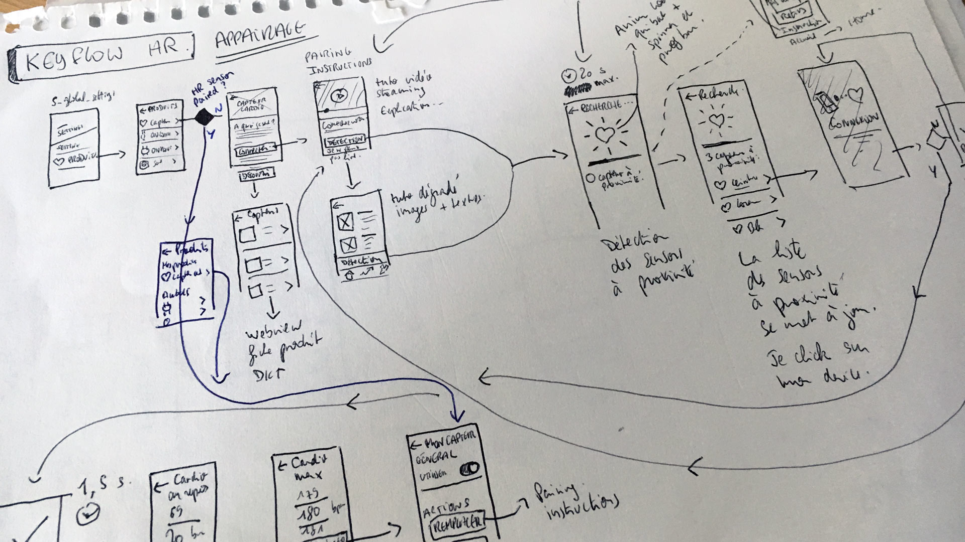
We gave a few iterations on the app such as adding HR sensor support, but decided it was time for a deeper change.
Our objective
Redefine the app’s role: from tracker to coach in order to empower users to achieve their goals and become a better version of themselves. We also focus on being accessible and friendly to beginners, contrasting with that took a more performance-driven approach.
Key goals:
Deliver personalized coaching
Support users’ real-life goals: fitness, fun, performance
Improve usability and motivation
Create a scalable foundation for new sports, plans, and features
Support Decathlon mission and business by encouraging folks to practise more sport and hence buy more sport equipment.
My role
Lead UX Designer (solo designer in a 10 people startup-like team)
I owned the redesign end-to-end:
Led research, IA, wireframes, prototyping, visual design, and testing
Collaborated daily with PM, devs, business, and comms teams
Managed trainee designers, freelances, improved design ops
Dev support, also very involved in quality testing
Key contribution highlights
Contributed to shifting the product vision from passive tracking to habit-building coaching
Boosted quality & retention: 3.2 → 4.5+ rating
Designed for motivation, not just utility
Built scalable IA for long-term feature growth
Embedded a culture of user feedback and UX maturity
Design process
1. Research & discovery
User interviews , some conducted by me, and others by Geonaute research team, revealed 4 core motivations we wanted to tackle:
Feel good (health, stress relief)
Feel beautiful (weight loss, confidence)
Have fun (social, group activities)
Prepare for a race (10k, marathons)
Partnered with R&D on sport psychology and motivation levers
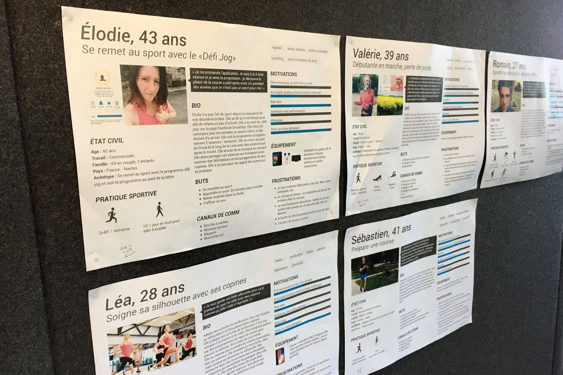
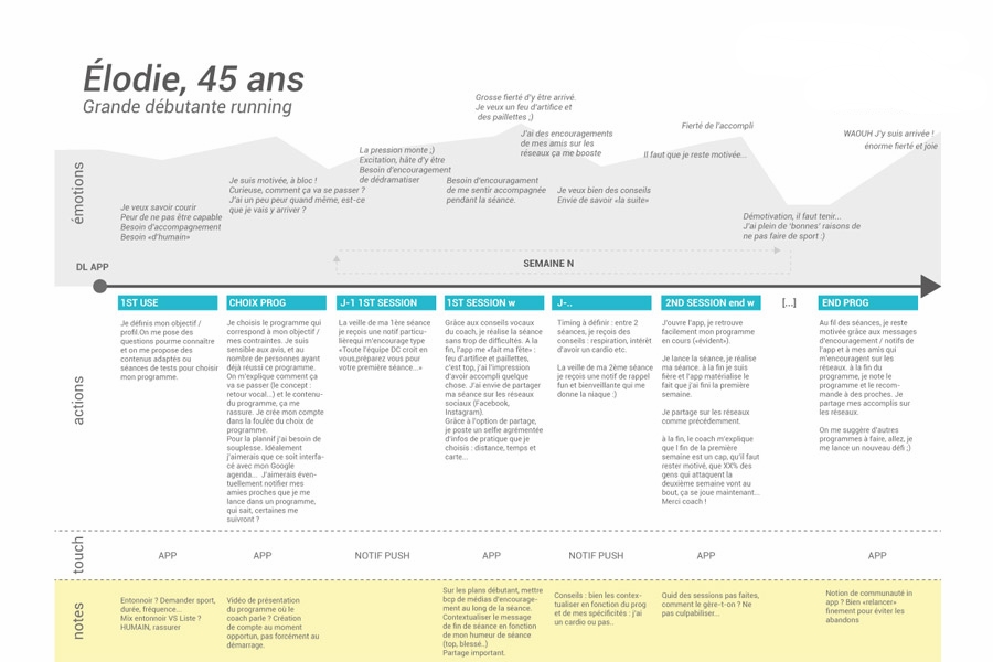
Created personas, journey maps
Worked on SUS baselines, that reveal the app was functional, but lacked emotion & memorability
2. Information architecture optimization
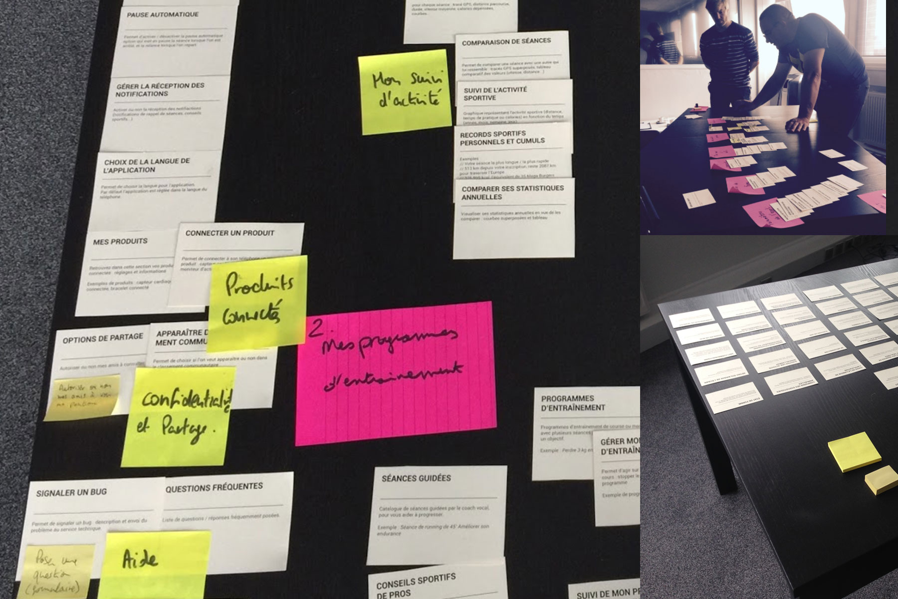
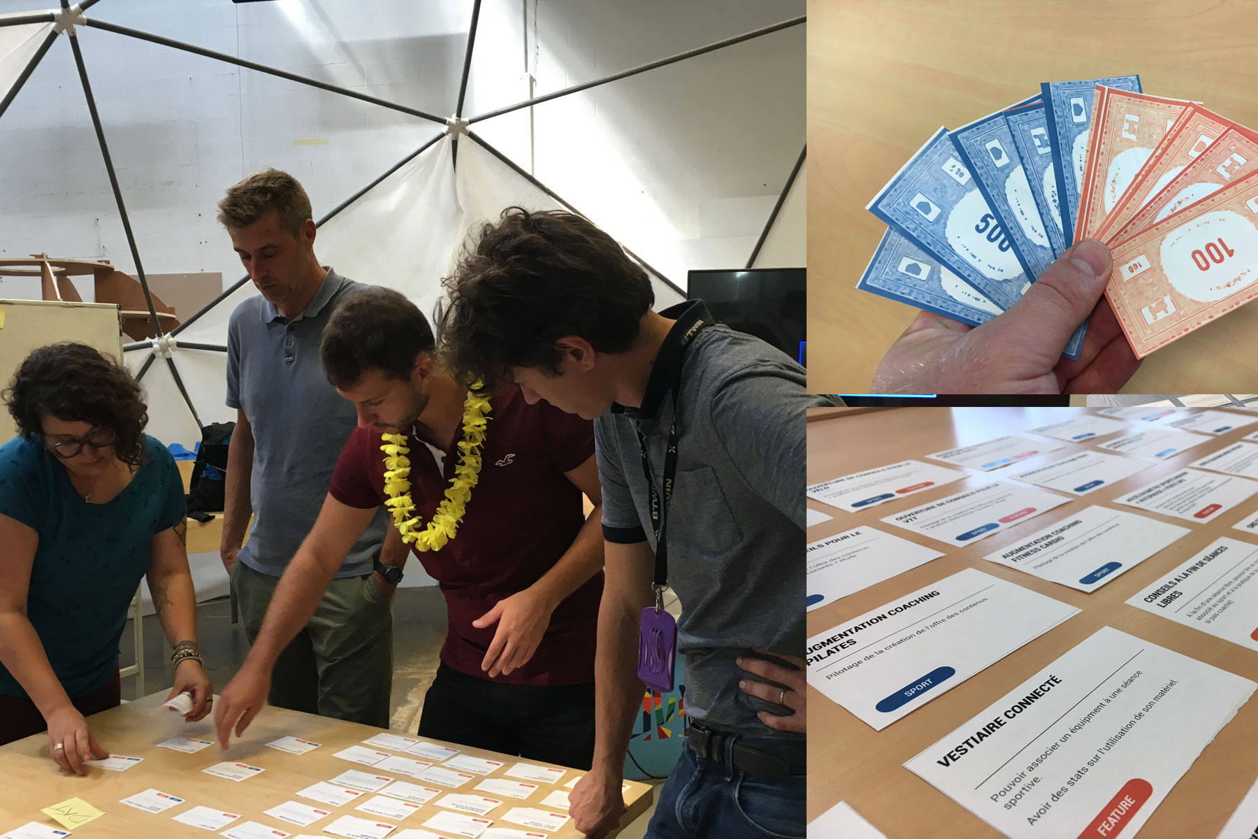
Card sorting to match user mental models
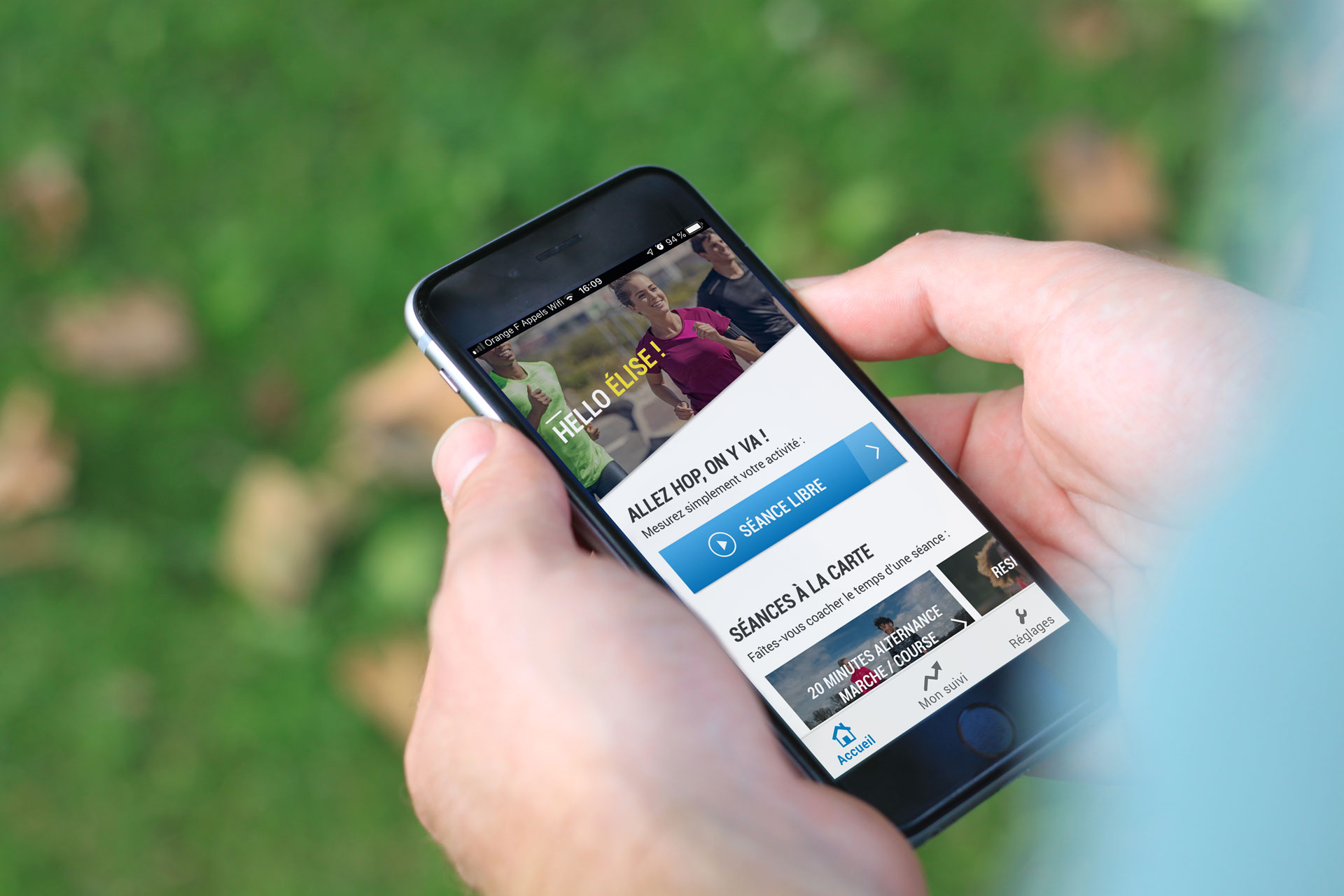
Simplified into 3 main areas: Home, Follow-up, Settings
Reduced navigation depth to improve focus and flow
3. Interaction design
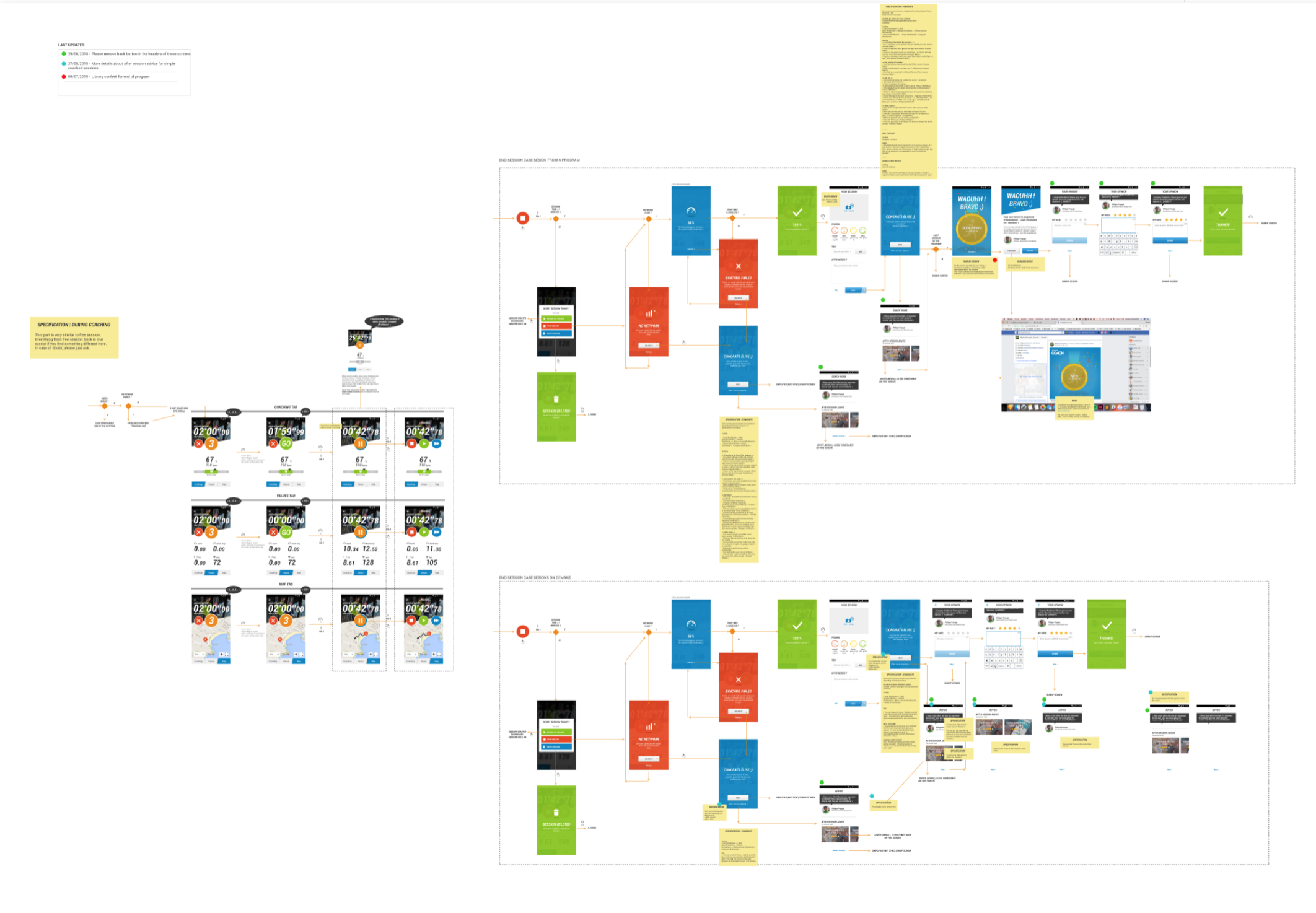
Designed coaching flows for beginners and advanced users
Prioritized plan discovery, onboarding, flexibility (e.g., rescheduling)
Introduced motivational mechanics and micro-moments of encouragement
4. User testing
Multiple rounds from concept to final design, where we learned the importance of flexibility and celebrating achievements
Address different levels of commitment, from free sessions to multi weeks coaching programs, advice and one-time sessions.
Simplified architecture: 3 tabs, key role of the home screen, simplified session summary
“future-looking” coaching plans vs “past sessions” feed
Refined UI for clarity, flexibility, and real-life sport scenarios
5. Visual design & handoff
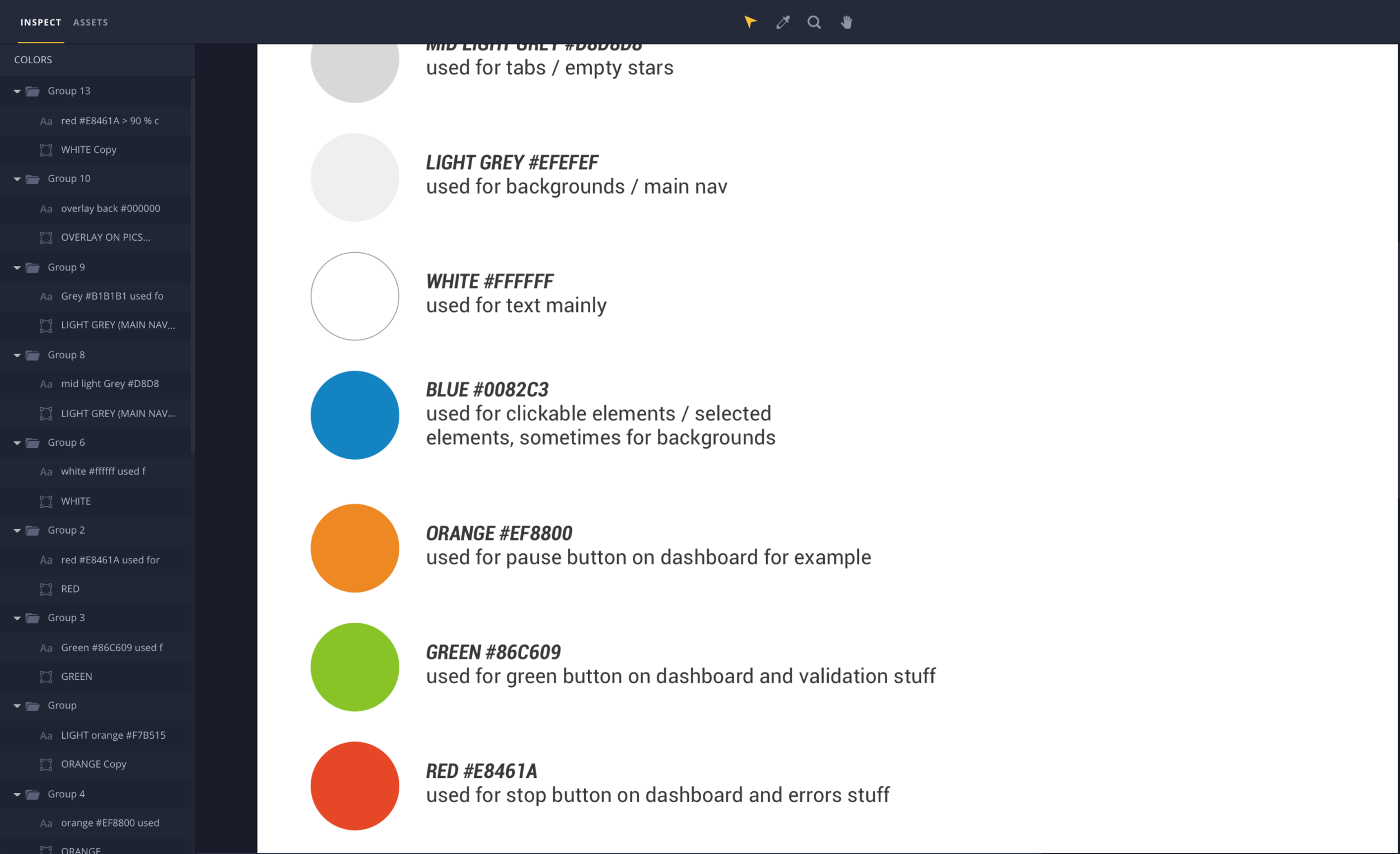
Full UI refresh aligned with Decathlon’s brand
Designed with real-world sport use in mind (e.g., glare, motion)
Created specs, motion guidelines, and scalable UI components
Defined tone of voice for a “coach in your pocket” experience
Results
User Impact
App rating: 3.2 → 4.5+
1M+ downloads
Users reported significant life impact:
“I’ve never done sport in my life… I followed the sessions to the letter.”“This app changed the way I train—clear, motivating, effective.”
Business Impact
Top-rated app within Decathlon’s ecosystem
Proven increase in store visits and spend among app users
Featured in stores ads, catalogues, and TV (post-launch)
Longevity
App remains largely unchanged 6+ years later
Proof of scalable, sustainable UX
What I learned
“Alone you go faster. Together you go further.”
→ Collaboration with PMs, devs, content, comm, research was key to success
“Make butter with water.”
→ A small team with clarity, shared vision and on a mission can do big things. We were a small team competing against bigger ones like Nike, Adidas, Runtastic, Strava, Endomondo etc.
“Dream first. Prioritize second. Implement third.”
→ Ambitious thinking at the start led to long-term impact
“Respect is design fuel.”
→ Listening to users created buy-in, trust, and better results
Beyond the brief: going the extra mile for users and the team
Prototyped video-based coaching (using advanced tools like Pixate and Origami, when Invision was the norm) to explore indoor sport use cases. This allowed to get buy-in and confidence to tackle new sports like Pilates
Created rituals: “Voice of the user” moments, shared metrics, rotating app store responders
Initiated viral and strategic features through hackathons (e.g. sharing workouts, progress moments, digital locker)
